This project focuses on the subjects of consumption and sustainability. The course’s goal was to create an index with complex data. Our team created an index that provides a complete and informative outlook on everyday objects that are harmful to the environment. The user can explore the index’s various objects and access every object’s information page, displaying the object’s life cycle.
The emphasis on operator design was to create pages that easily explain the service. To achieve this, I proposed icons that convey a sense of friendliness, a logo and main color that inspire trust, and predominantly used clean and trustworthy tones of blue and gray.
Typography UI was employed to enhance readability.
︎ Roles :
Branding designer,
UXUI designer, Web designer
︎ Duration :
3 months 2023
︎ Tools :
Figma,
Adobe illustration, photoshop
Branding designer,
UXUI designer, Web designer
︎ Duration :
3 months 2023
︎ Tools :
Figma,
Adobe illustration, photoshop


Goal, Needs
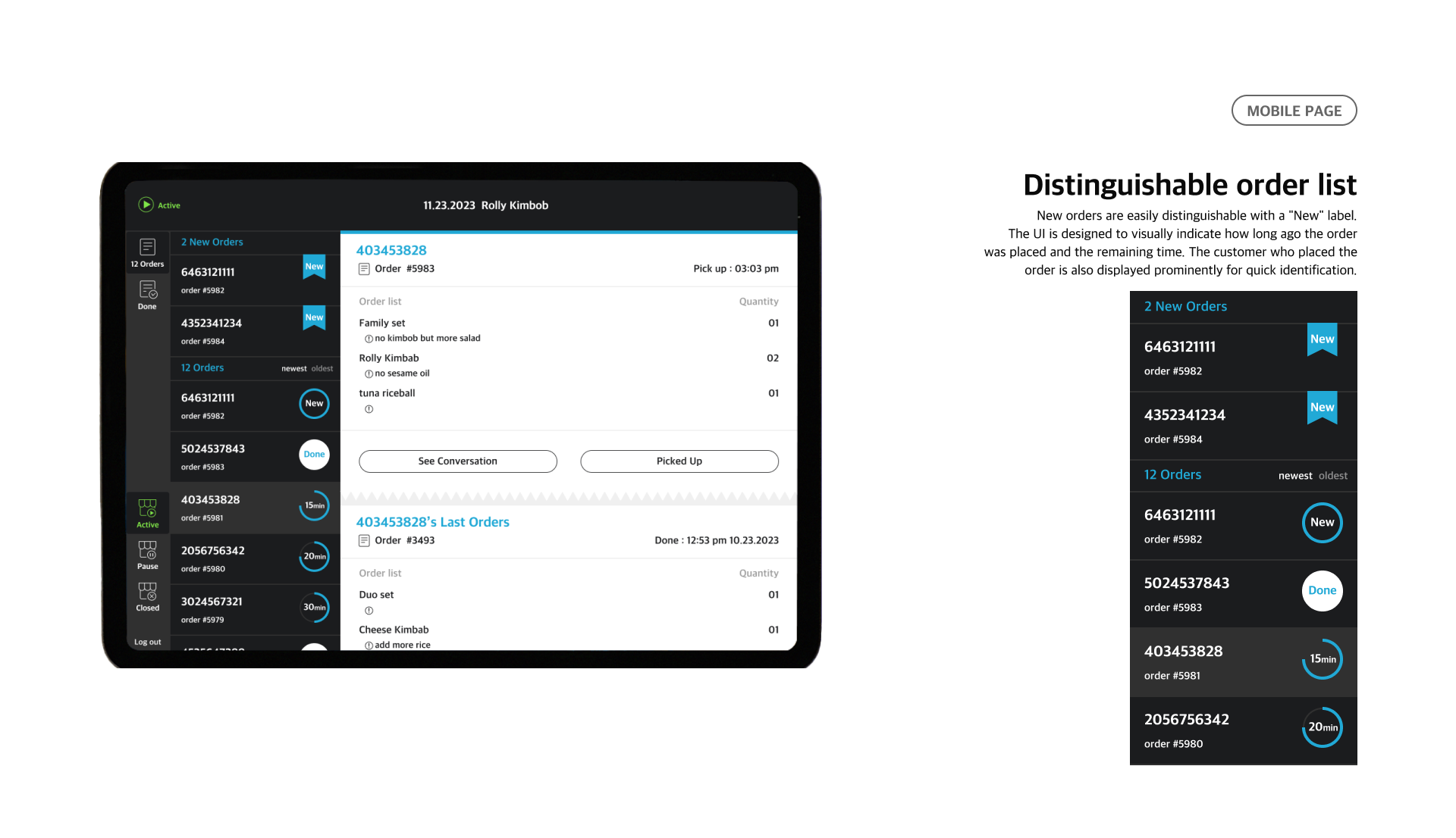
Through interviews with target users (store owners and part-time workers), Team members identified the actual needs of users. Additionally, we conducted an analysis of the needs and translated them into functionalities. Recognizing that the target users prefer using tablets or monitors over phones for program usage, we designed the UI to be compatible with these sizes.
Style Guide
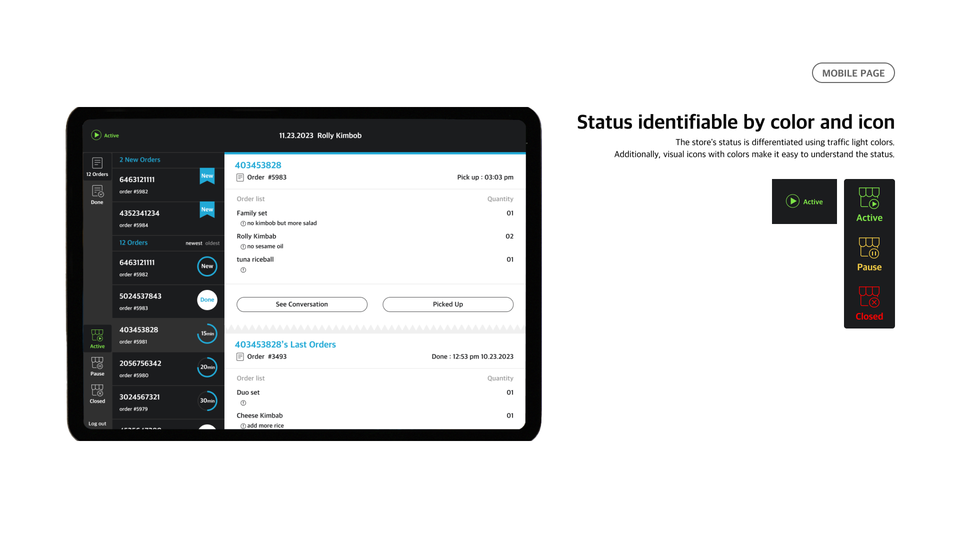
The emphasis on operator design was to create pages that easily explain the service. To achieve this, I proposed icons that convey a sense of friendliness, a logo and main color that inspires trust, sophistication of industrial structure, and usefulness.
I used clean and trustworthy tones of blue and light gray.
Typography UI was employed to enhance readability. So I used to inter and appleSDGothicNeo with different thicknesses for highlight title or body.

APP UI
Through interviews with target users (store owners and part-time workers), Team members identified the actual needs of users. Additionally, we conducted an analysis of the needs and translated them into functionalities. Recognizing that the target users prefer using tablets or monitors over phones for program usage, we designed the UI to be compatible with these sizes.
Through interviews with target users (store owners and part-time workers), Team members identified the actual needs of users. Additionally, we conducted an analysis of the needs and translated them into functionalities. Recognizing that the target users prefer using tablets or monitors over phones for program usage, we designed the UI to be compatible with these sizes.

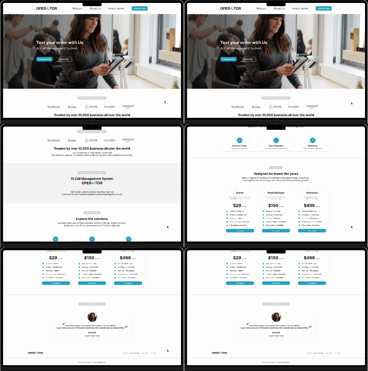
Web site
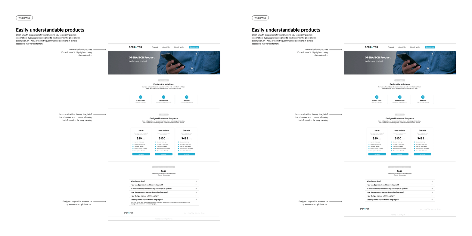
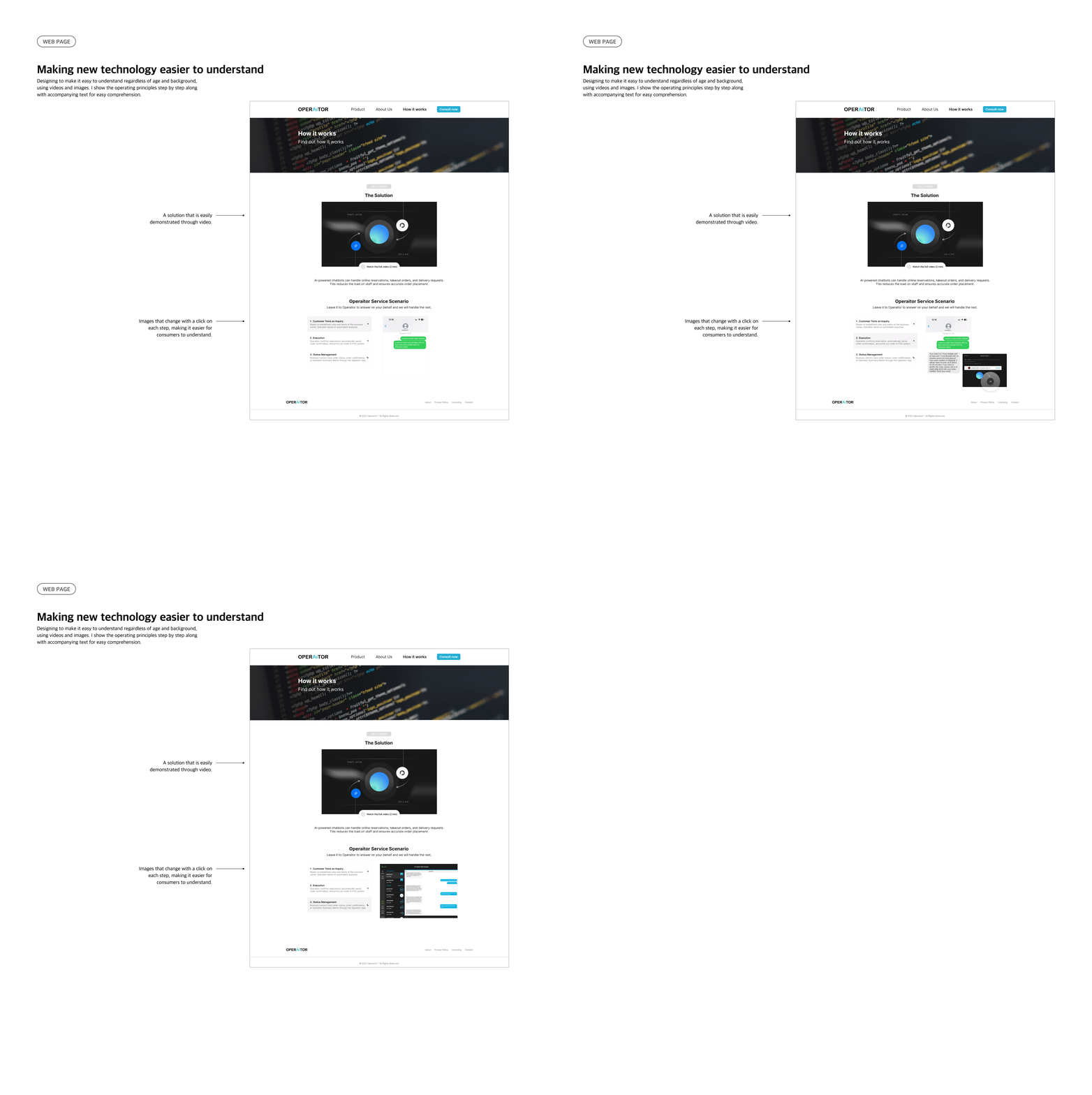
I structured the website to make it easier to understand new technologies. With a clean UI, I incorporated the logo's accent color in specific sections.
I designed the page not only to demonstrate a good understanding of the technology but also to instill a sense of trust.
I structured the website to make it easier to understand new technologies. With a clean UI, I incorporated the logo's accent color in specific sections.
I designed the page not only to demonstrate a good understanding of the technology but also to instill a sense of trust.

